California Humanities
PROJECT Overview
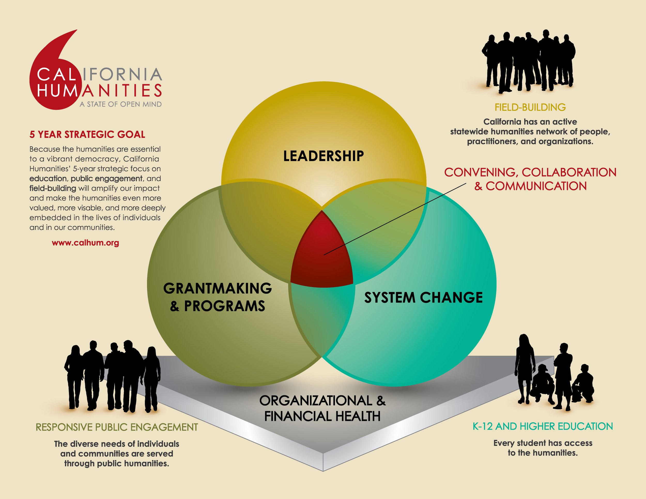
Narrative Leadership at Statewide Scale
California Humanities, Oakland, CA
Role
Strategic Narrative Partner · Art Director · Web Designer · User Experience Lead
We served as brand strategist, art director, and digital experience lead — ensuring every touchpoint carried the same story with the same authority. The work focused not just on how California Humanities looked, but on what they could now say — and to whom.
Brand Transition + Community Realignment
When California Humanities relocated from San Francisco to Oakland, they sought a strategic brand partner to help reintroduce the organization, strengthen its identity, and anchor its presence within the Oakland community. MyGroove Design, Inc. supported the transition by developing a refreshed brand system and communication framework that honored the organization’s legacy while aligning with its new home and evolving statewide role.
Brand Awareness + Digital Experience Evolution
Our work focused on elevating brand awareness and strengthening messaging across audiences. For California Humanities’ new website, calhum.org, we served as brand strategist, art director, web designer, and user experience lead, ensuring a cohesive identity and intuitive digital experience that reflected the organization’s mission and diverse statewide impact.

Transition + Realignment
California Humanities operates at the intersection of public funding, cultural storytelling, and statewide community engagement.
When the organization relocated from San Francisco to Oakland, they weren't just changing addresses. They were entering a city with its own history, its own identity, and its own standards for who belongs here. Trust had to be earned through clarity, consistency, and genuine cultural respect.
During a period of organizational transition and increased visibility, California Humanities needed a narrative system that could hold up across every audience they serve: funders, community partners, program participants, and the public.
Creative Strategy
The engagement aligned brand strategy, visual identity, and editorial design into a scalable storytelling system. The work strengthened how California Humanities communicates its mission, values, and statewide impact, supporting trust, clarity, and long-term relevance during a moment of change.
Key pillars of the work:
Narrative Alignment: Refined voice, tone, and messaging standards to ensure consistency across all audiences and platforms.
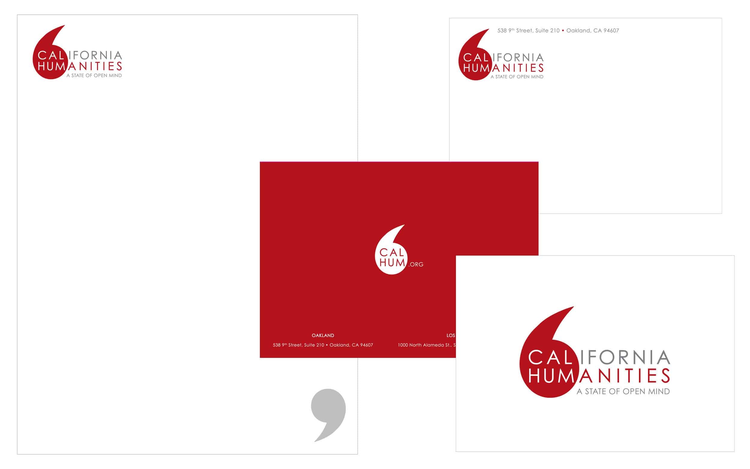
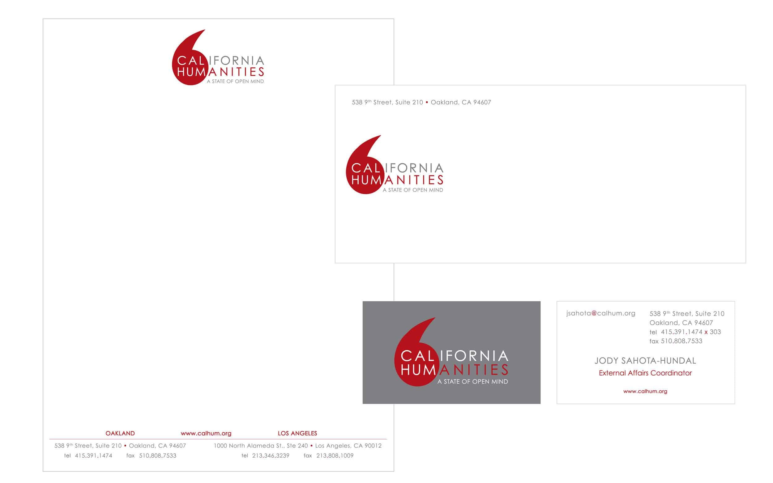
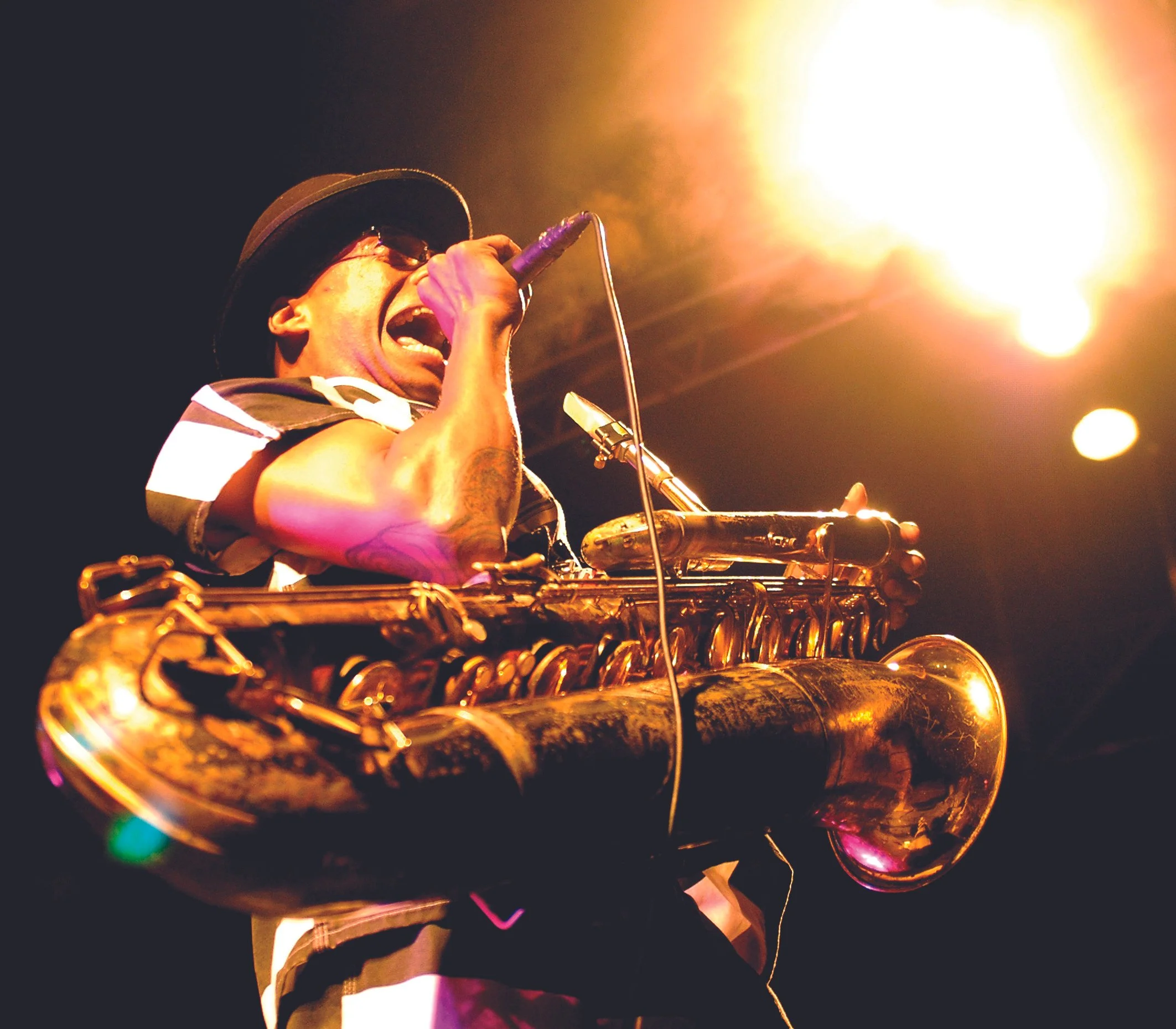
Visual Identity: Reinforced logo usage, color consistency, typography, and imagery standards. Clear, warm, and authoritative across every touchpoint.
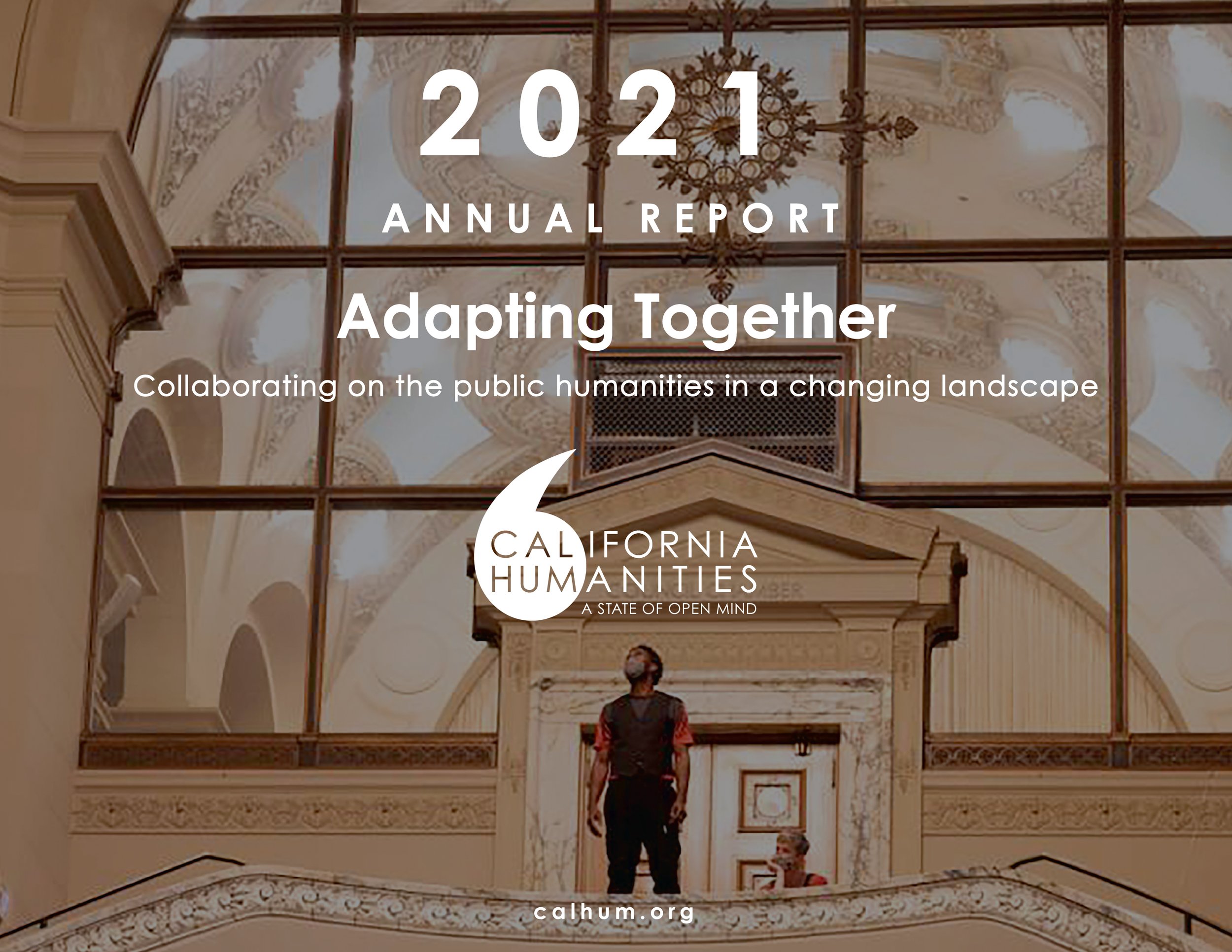
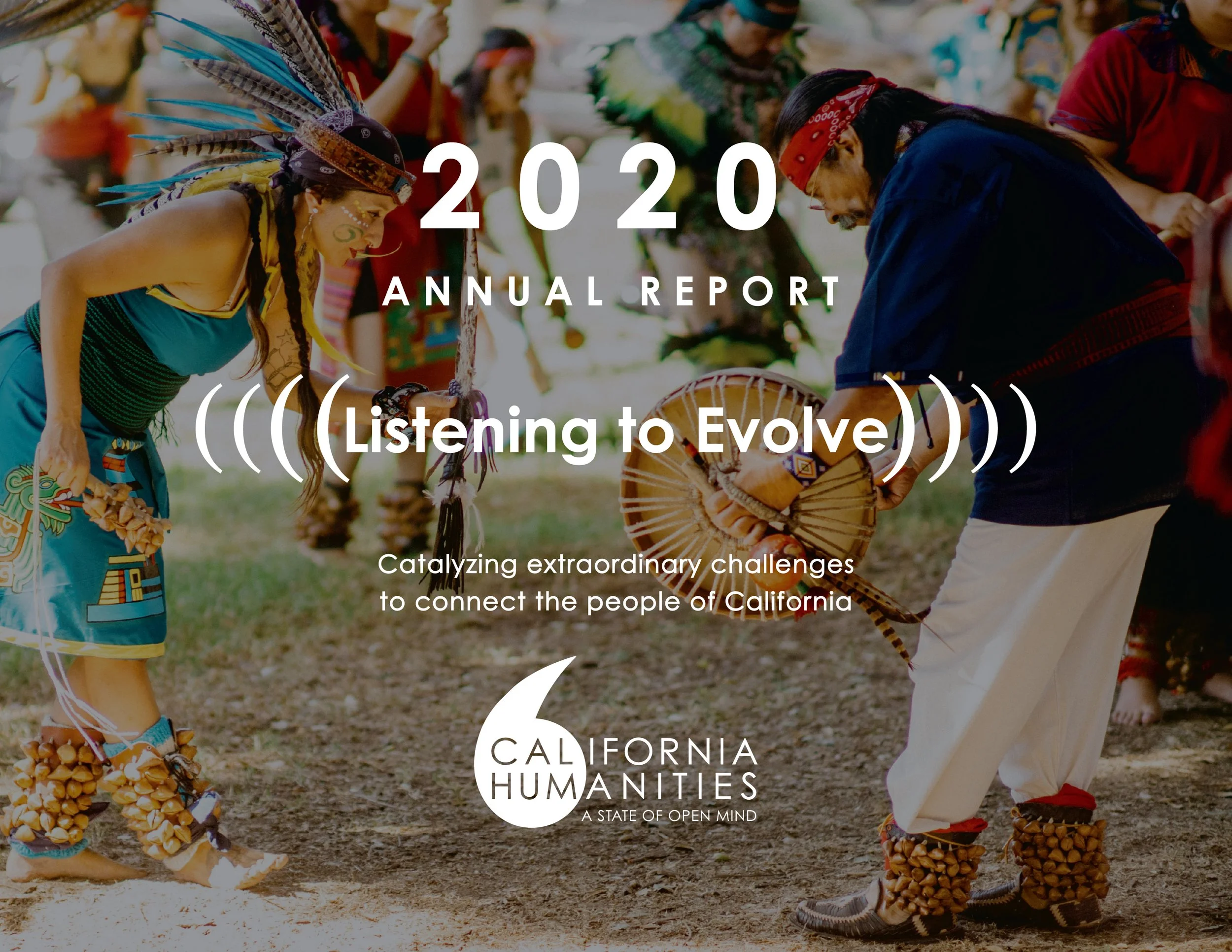
Annual Report System: Designed a scalable framework that allows each report to feel visually distinct year to year while remaining unmistakably CalHum. Built for impact storytelling, program highlights, grant recipient features, and data-driven insights.
Digital Integration: Extended design decisions across the website and digital assets, creating a seamless experience that strengthened overall brand recognition.

Outcomes
The engagement resulted in a unified brand and storytelling system that holds across every audience, every platform, and every moment of public accountability.
Clear visual standards across logo, color, typography, and imagery.
• A scalable annual report system for long-term use
• Stronger impact storytelling across programs and community voices
• Consistent alignment across print, web, and digital assets
• The institutional confidence to communicate with clarity in any room
California Humanities didn't just look different after this work. They communicated differently. And the people they serve felt that difference.
GRAPHIC ELEMENTS: CONSISTENCY IN EVERY DETAIL
From typography and layout grids to imagery and color application, every element was designed to work as part of a cohesive system. This ensured that regardless of format or medium, the brand remained instantly recognizable and aligned with its mission.